by slehal2023 | Jun 3, 2022 | DataViz (2022)
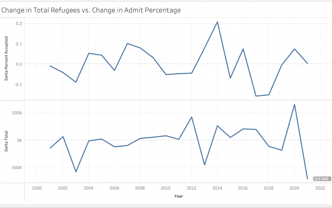
This graph shows the change in refugee applications vs. admittance rates over time. The peaks and troughs of the two lines match up reasonably well suggesting that refugee admittance rates are flexible–nations increase their quotas to accommodate emergency...
by rnovofastovsky2025 | Jun 3, 2022 | DataViz (2022)
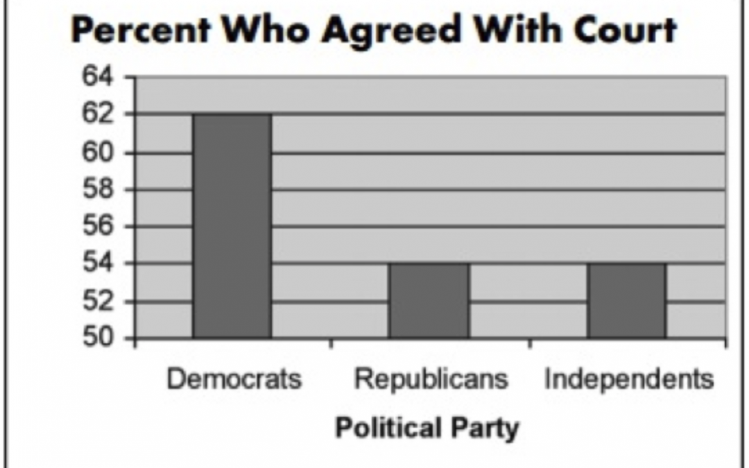
This graph is misleading towards the human eye. Here, at first glance without looking at the numbers, it looks like the democrats have about 3 times as many people who agrees compared to the other political parties when that is incorrect. There is actually a very...
by cprice2025 | Jun 3, 2022 | DataViz (2022)
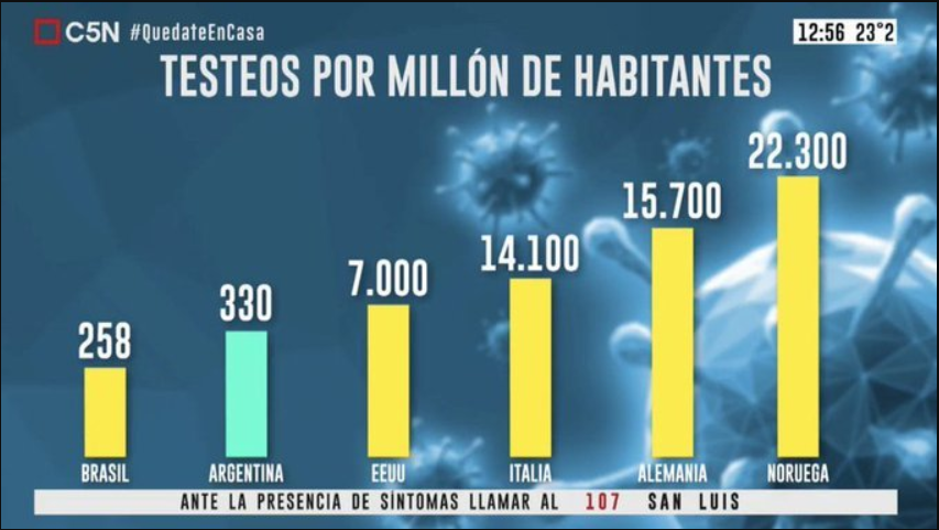
This Argentina graph shows the number of COVID-19 tests per million people. In the graph, the bar shows that Argentina tests almost as many people as the USA, even though there is a 6670 million number difference. The graph makes Argentina look like their testing...
by slehal2023 | Jun 3, 2022 | DataViz (2022)
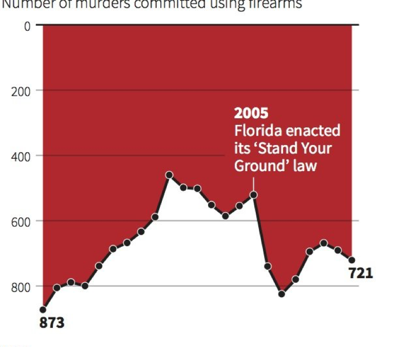
The inverted y-axis mistakenly implies that the “Stand Your Ground” law caused a decrease in gun deaths. To fix it the y-axis should be changed so it increases vertically.
by hlear2025 | Jun 3, 2022 | DataViz (2022)
This graph is misleading because a) it doesn’t have a label for the y axis, and b) the graph makes the difference between Democrats and Republicans/Independents seem much larger when in reality, it’s only a 14% difference. Having different number marks...
by Milenka Men | Jun 3, 2022 | DataViz (2022)
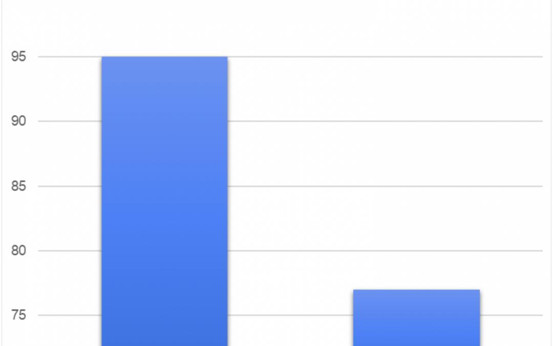
This graph shows the number of sales for two products. This graph is misleading since the y-axis does not start at zero. Oftentimes, the human brain is calibrated to start at zero, but the y-axis on this graph doesn’t start at zero making this visualization...


Recent Comments