
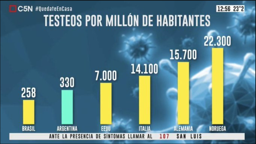
This Argentina graph shows the number of COVID-19 tests per million people. In the graph, the bar shows that Argentina tests almost as many people as the USA, even though there is a 6670 million number difference. The graph makes Argentina look like their testing numbers aren’t as bad as they really are, which makes the graph misleading.
Source: https://towardsdatascience.com/stopping-covid-19-with-misleading-graphs-6812a61a57c9
Recent Comments