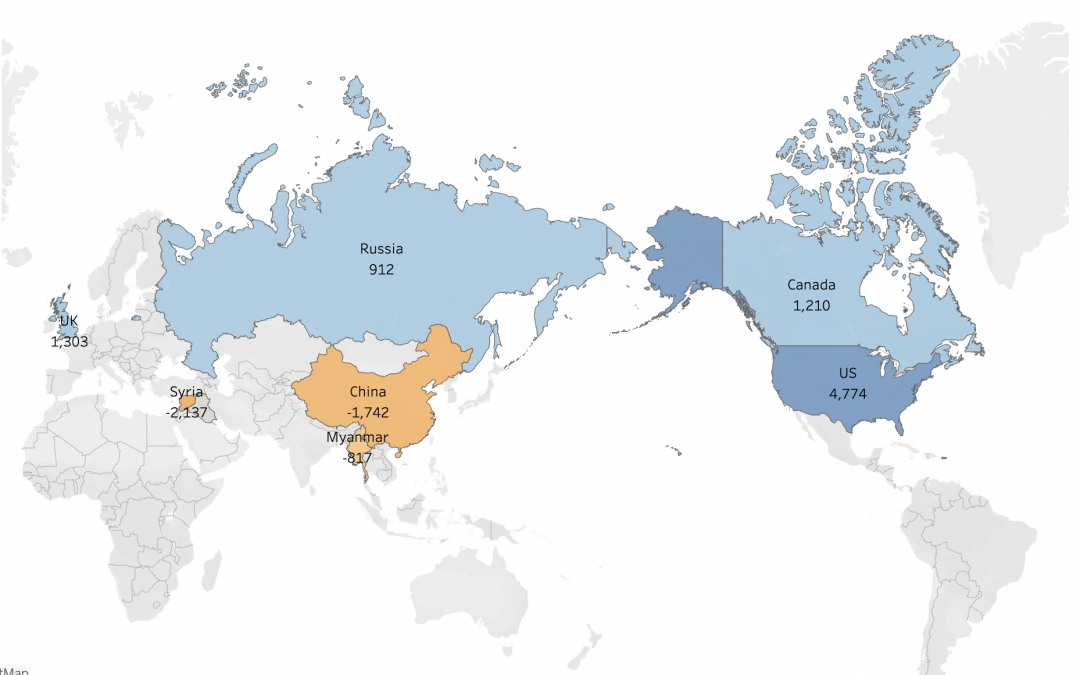
by Milenka Men | Jun 10, 2022 | DataViz (2022)
https://public.tableau.com/shared/6KYKFQ22J?:display_count=n&:origin=viz_share_link
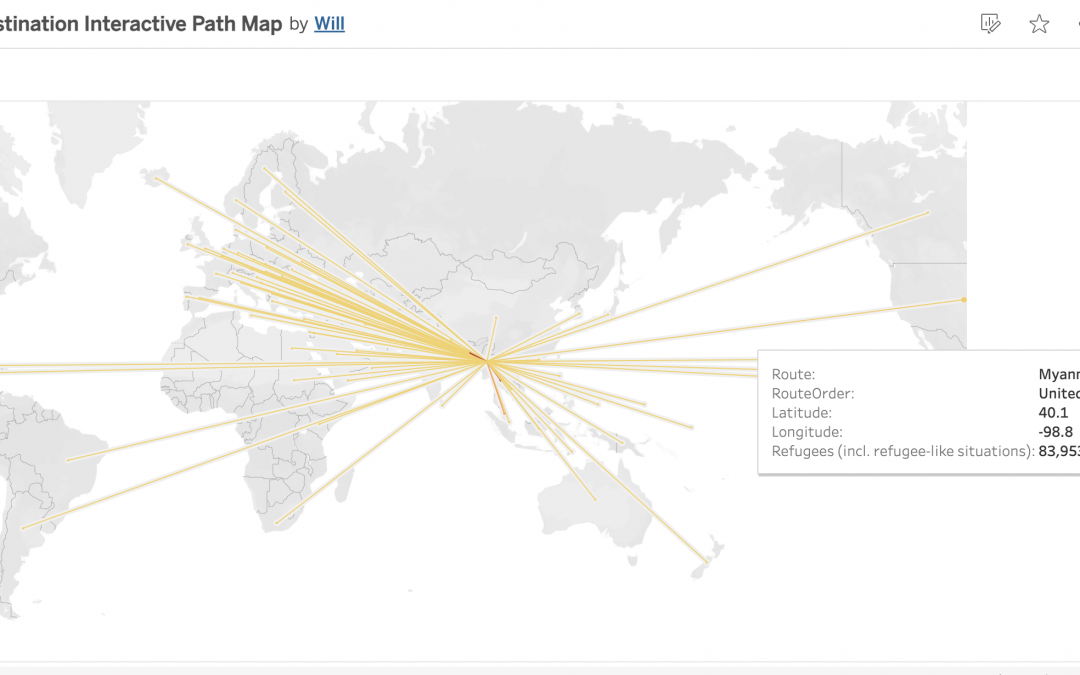
by wfrancis2025 | Jun 6, 2022 | DataViz (2022)
This shows the different places/destinations of refugees when they were trying to get visas and get out of their homelands because of an unfortunate event.
by kodunlami2025 | Jun 3, 2022 | DataViz (2022)
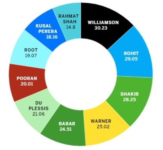
Pie charts are a way of displaying data that is somewhat narrow in usage. All the percentages that appear on pie charts have to have a sum of 100, but the chart above shows multiple percentages that exceed this number. For this data, something like a bar chart would...
by slehal2023 | Jun 3, 2022 | DataViz (2022)
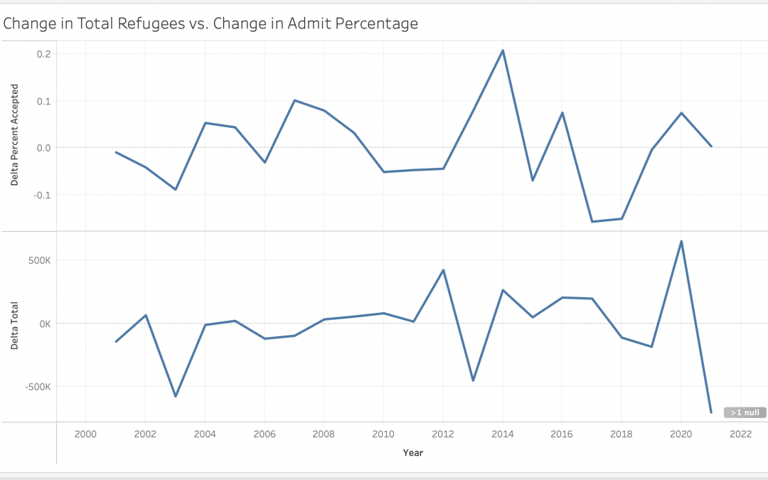
This graph shows the change in refugee applications vs. admittance rates over time. The peaks and troughs of the two lines match up reasonably well suggesting that refugee admittance rates are flexible–nations increase their quotas to accommodate emergency...
by rnovofastovsky2025 | Jun 3, 2022 | DataViz (2022)
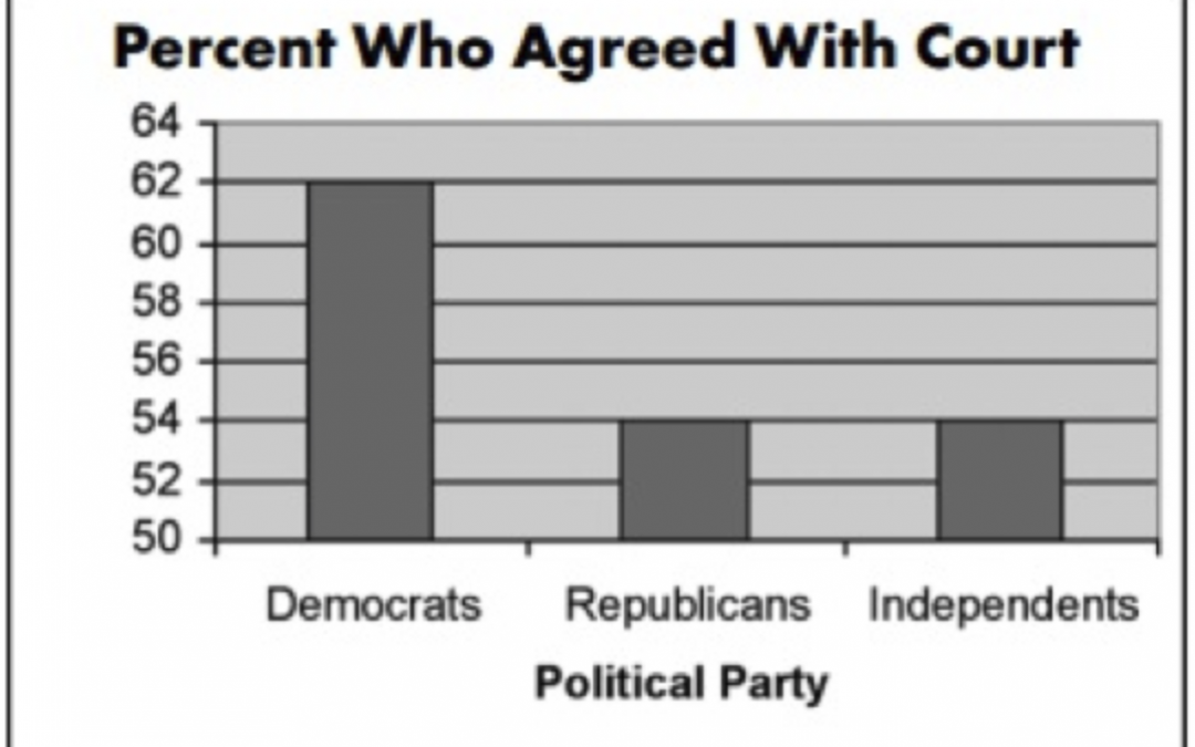
This graph is misleading towards the human eye. Here, at first glance without looking at the numbers, it looks like the democrats have about 3 times as many people who agrees compared to the other political parties when that is incorrect. There is actually a very...
by cprice2025 | Jun 3, 2022 | DataViz (2022)
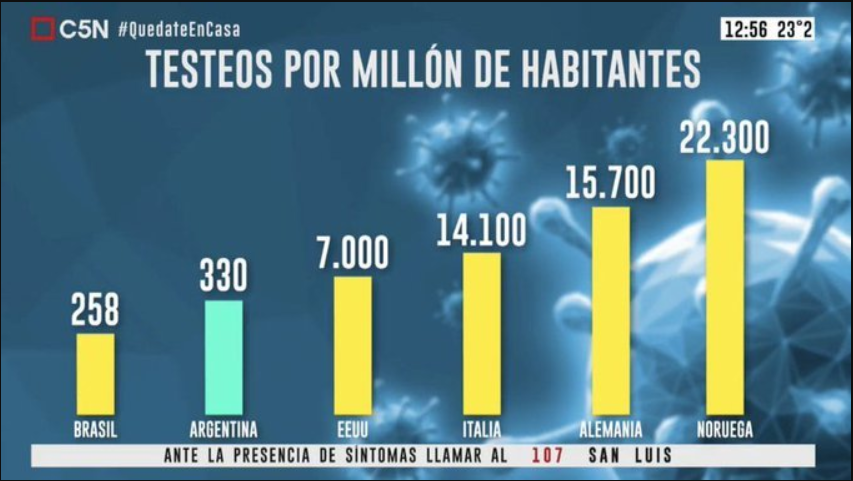
This Argentina graph shows the number of COVID-19 tests per million people. In the graph, the bar shows that Argentina tests almost as many people as the USA, even though there is a 6670 million number difference. The graph makes Argentina look like their testing...

Recent Comments