by tluo2026 | Jun 8, 2023 | DataViz (2023), Highlighted
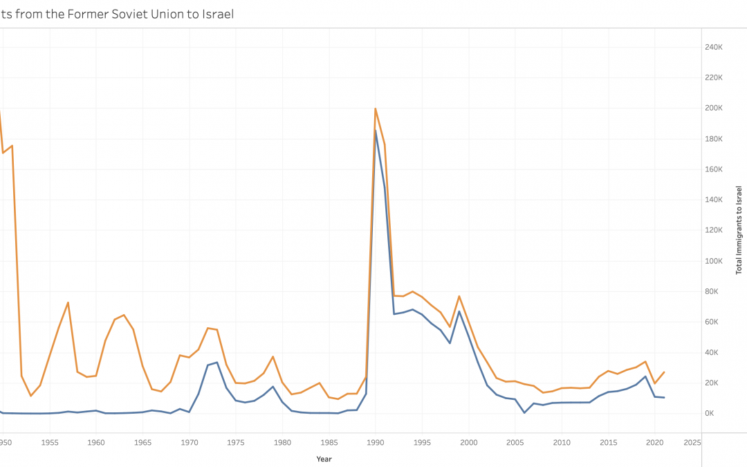
https://public.tableau.com/app/profile/tingting.luo/viz/JewishImmigrantsfromtheFSUtoIsrael/Sheet1?publish=yes This dual-line graph shows the total number of immigrants to Israel and the number of Soviet Jews who immigrated to Israel. This graph not only shows the...
by tluo2026 | Jun 8, 2023 | DataViz (2023)
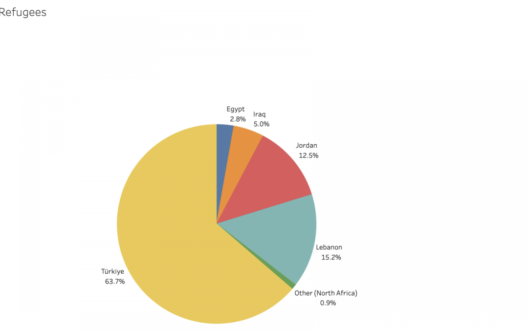
https://public.tableau.com/app/profile/tingting.luo/viz/CountrieswithSyrianRefugees/Sheet1?publish=yes This pie chart contains data from the UNHCR. The pie chart effectively shows the country which has the most Syrian refugees, which is Türkiye, and also shows the...
by dkarnaugh2024 | Jun 8, 2023 | DataViz, DataViz (2023), Highlighted
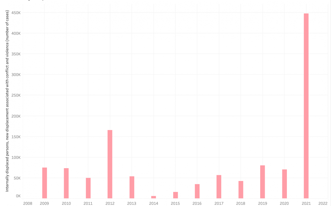
This bar graph shows the amount of new internally displaced people every year, caused by domestic conflict and violence, over the course of 13 years. It is important to align this graph with key moments of Burmese political history. In 2012, the Democratic Party won...
by Milenka Men | Jun 10, 2022 | DataViz (2022)
https://public.tableau.com/shared/6KYKFQ22J?:display_count=n&:origin=viz_share_link
by wfrancis2025 | Jun 6, 2022 | DataViz (2022)
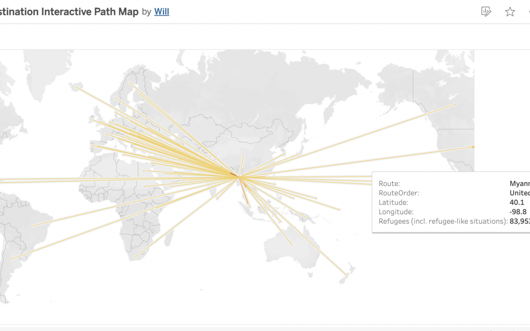
This shows the different places/destinations of refugees when they were trying to get visas and get out of their homelands because of an unfortunate event.
by kodunlami2025 | Jun 3, 2022 | DataViz (2022)
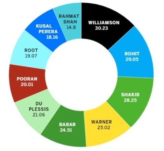
Pie charts are a way of displaying data that is somewhat narrow in usage. All the percentages that appear on pie charts have to have a sum of 100, but the chart above shows multiple percentages that exceed this number. For this data, something like a bar chart would...

Recent Comments