
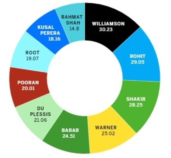
Pie charts are a way of displaying data that is somewhat narrow in usage. All the percentages that appear on pie charts have to have a sum of 100, but the chart above shows multiple percentages that exceed this number.
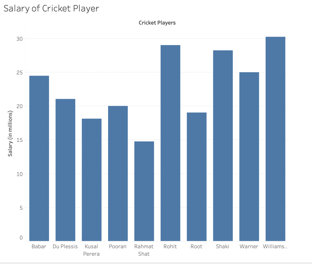
For this data, something like a bar chart would be better for this type of data. Nothing here is being compared, but just shown. There are no labels either, so you wouldn’t know what the chart is even about.
SOURCE: https://www.jotform.com/blog/bad-data-visualization/
I wouldn’t have even realized this was a misleading chart, thanks for pointing this out. I have to be more careful with graphs in the future because you can never tell from first glance if it’s false or not.
I agree this is a misleading chart. I strongly dislike pie charts and I feel that they often do not represent data correctly.