by slehal2023 | Jun 3, 2022 | DataViz (2022)
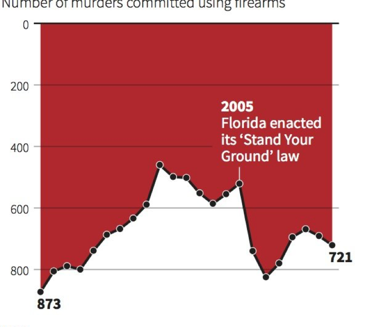
The inverted y-axis mistakenly implies that the “Stand Your Ground” law caused a decrease in gun deaths. To fix it the y-axis should be changed so it increases vertically.
by hlear2025 | Jun 3, 2022 | DataViz (2022)
This graph is misleading because a) it doesn’t have a label for the y axis, and b) the graph makes the difference between Democrats and Republicans/Independents seem much larger when in reality, it’s only a 14% difference. Having different number marks...
by Milenka Men | Jun 3, 2022 | DataViz (2022)
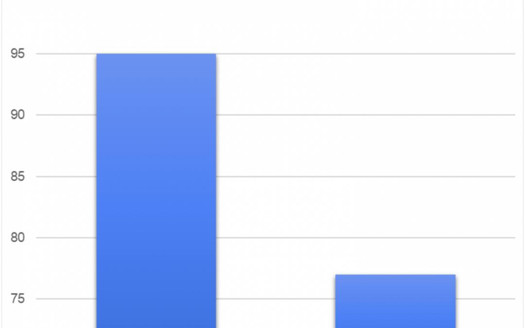
This graph shows the number of sales for two products. This graph is misleading since the y-axis does not start at zero. Oftentimes, the human brain is calibrated to start at zero, but the y-axis on this graph doesn’t start at zero making this visualization...
by kodunlami2025 | Jun 1, 2022 | DataViz (2022)
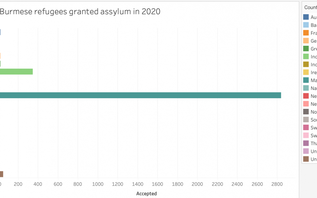
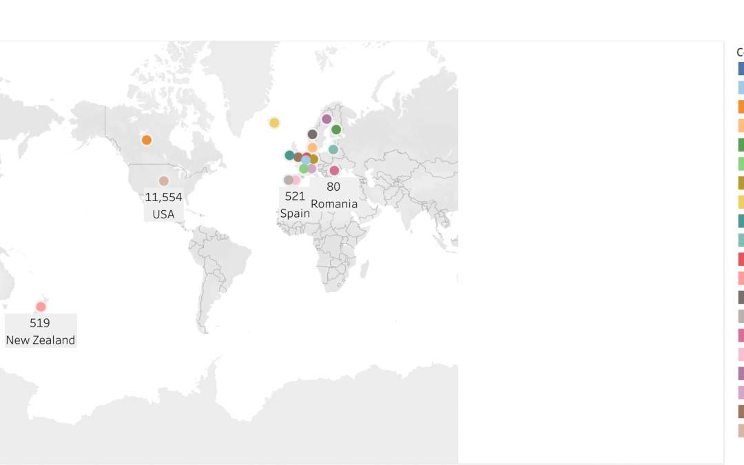
SOURCE: https://www.worlddata.info/asia/burma/asylum.php Aside from Malaysia, a country that neighbors Myanmar, many countries took a low percentage of their asylum applicants. Aside from Malaysia, no other country took >400 refugees.
by rnovofastovsky2025 | Jun 1, 2022 | DataViz (2022)
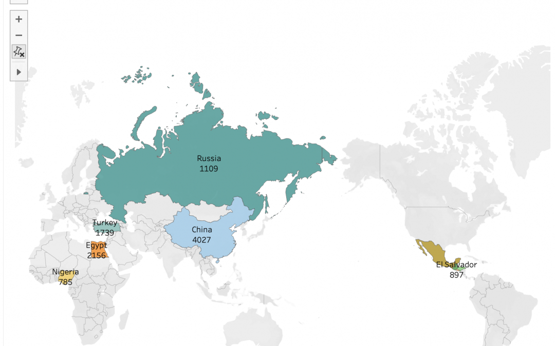
I obtained this image from:https://www.migrationpolicy.org/article/refugees-and-asylees-united-states-2021#top-statesThis graph is showing the number of affirmative asylees in different areas of the world. The top three countries have the most amount of asylees are...
by hlear2025 | Jun 1, 2022 | DataViz (2022)


Recent Comments