by pbremm2026 | Jun 5, 2024 | DataViz (2024)
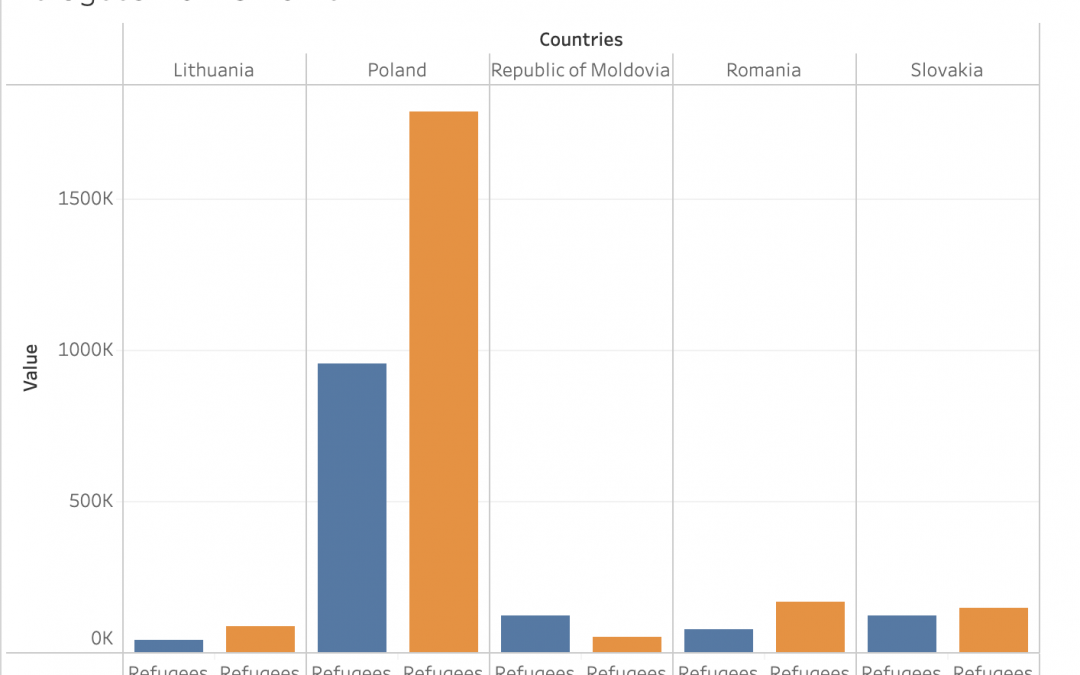
This data shows how many Ukrainian refugees are in countries that are featured in the Refugee Response Plan and how many Ukrainian refugees applied for asylum, TP or similar national protection schemes, in those countries. The blue columns in the graph represent the...

by hdiao2026 | Jun 5, 2024 | DataViz (2024)
https://trac.syr.edu/immigration/reports/630/ This bar graph shows the percent of people denied asylum who requested for it in the year 2020 in different countries, mostly in the continents of Asia and South America, though Mexico is in North America and Cameroon is...
by sdavidkhanian2027 | Jun 5, 2024 | DataViz (2024)
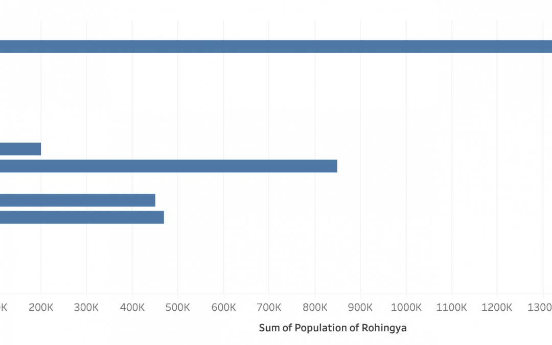
The Rohingya are an ethnic minority group from Myanmar that have faced decades of discrimination and repression under successive Myanmar authorities. They have been effectively denied citizenship under the 1982 Citizenship Law, and thus are one of the largest...
by edavidkhanian2025 | Jun 5, 2024 | DataViz (2024)
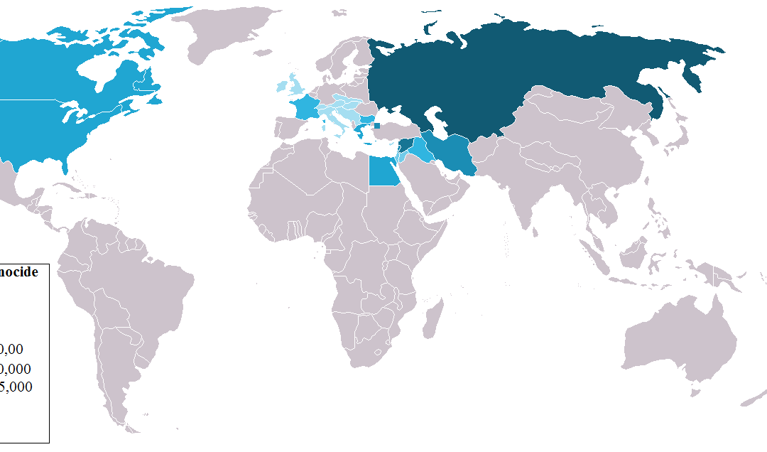
Data visualization is the graphical representation of information and data points, with the usage charts, graphs, and maps to help viewers understand trends, outliers, and overall patterns. The primary goal of data visualization is to communicate complex data clearly...
by vxie2026 | Jun 5, 2024 | DataViz (2024)
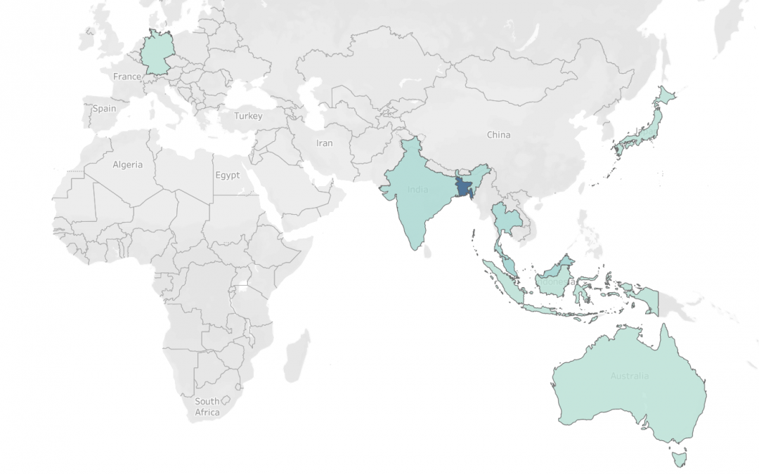
Not all of the countries that Myanmar refugees are living in are included in this data visualization because their numbers are very small. Just to note, there are Burmese refugees in Australia, Germany, and Indonesia; the number of refugees from Myanmar in these three...

by jronnen2026 | Jun 9, 2023 | DataViz (2023)
The three types of data visualization include confirmatory, explanatory, and exploratory. Confirmatory means that you are using the data visualization to prove a hypothesis. Explanatory means that you are explaining something using data visualization. Exploratory...


Recent Comments