by athuzar | Jun 6, 2022 | Gallery (2022)
IMG_7461 IMG_7460 IMG_7458 IMG_7459 IMG_7457 IMG_7456 IMG_7453 IMG_7455 IMG_7451 IMG_7449 IMG_7450 IMG_7448 IMG_7477 IMG_7476 IMG_7474 IMG_7475 IMG_7472 IMG_7473 IMG_7470 IMG_7471 IMG_7468 IMG_7469 IMG_7467 IMG_7465 IMG_7466 IMG_7463...

by athuzar | Jun 4, 2022 | Gallery (2022)
IMG_7438 IMG_7437 IMG_7436 IMG_7435 IMG_7434 IMG_7429 IMG_7428 IMG_7427 IMG_7426 IMG_7425 IMG_7424 IMG_7423 IMG_7422 IMG_7421 IMG_7420 IMG_7419 IMG_7418 IMG_7417 IMG_7416 IMG_7415 IMG_7414 IMG_7413 IMG_7412 IMG_7410 IMG_7411...

by athuzar | Jun 4, 2022 | Gallery (2022)
IMG_7404 IMG_7403 IMG_7402 IMG_7401 IMG_7398 IMG_7397 IMG_7395 IMG_7394 IMG_7393 IMG_7392 IMG_7391 IMG_7390 IMG_7389 IMG_7388 IMG_7387 IMG_7386 IMG_7385 IMG_7384 IMG_7383 IMG_7382 IMG_7381 IMG_7380 IMG_7379 IMG_7378 IMG_7377 IMG_7376 IMG_7375 IMG_7374 IMG_7373...

by kodunlami2025 | Jun 3, 2022 | DataViz (2022)
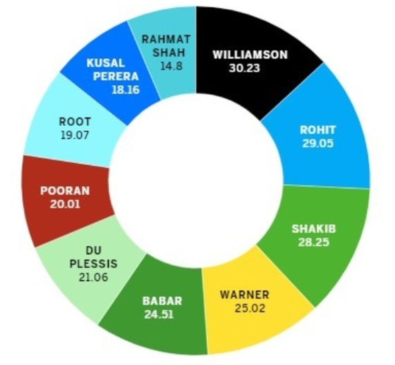
Pie charts are a way of displaying data that is somewhat narrow in usage. All the percentages that appear on pie charts have to have a sum of 100, but the chart above shows multiple percentages that exceed this number. For this data, something like a bar chart would...

by slehal2023 | Jun 3, 2022 | DataViz (2022)
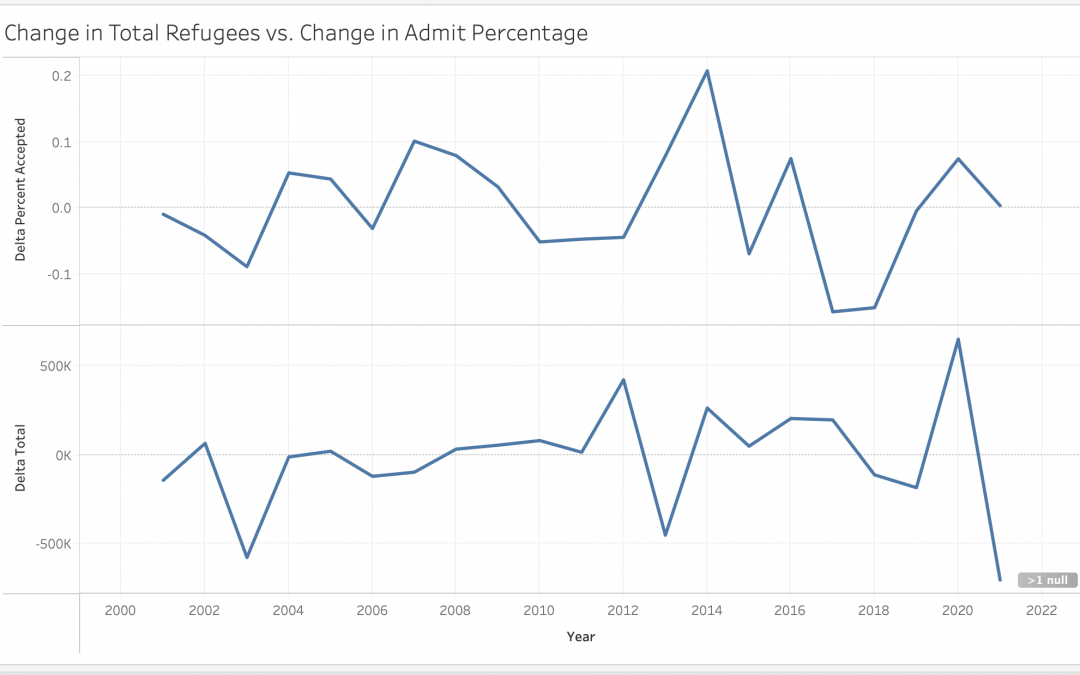
This graph shows the change in refugee applications vs. admittance rates over time. The peaks and troughs of the two lines match up reasonably well suggesting that refugee admittance rates are flexible–nations increase their quotas to accommodate emergency...


Recent Comments