
by jronnen2026 | Jun 9, 2023 | DataViz (2023)
The three types of data visualization include confirmatory, explanatory, and exploratory. Confirmatory means that you are using the data visualization to prove a hypothesis. Explanatory means that you are explaining something using data visualization. Exploratory...
by tluo2026 | Jun 8, 2023 | DataViz (2023), Highlighted
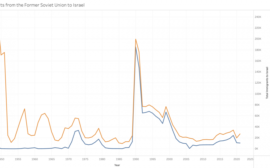
https://public.tableau.com/app/profile/tingting.luo/viz/JewishImmigrantsfromtheFSUtoIsrael/Sheet1?publish=yes This dual-line graph shows the total number of immigrants to Israel and the number of Soviet Jews who immigrated to Israel. This graph not only shows the...
by tluo2026 | Jun 8, 2023 | DataViz (2023)
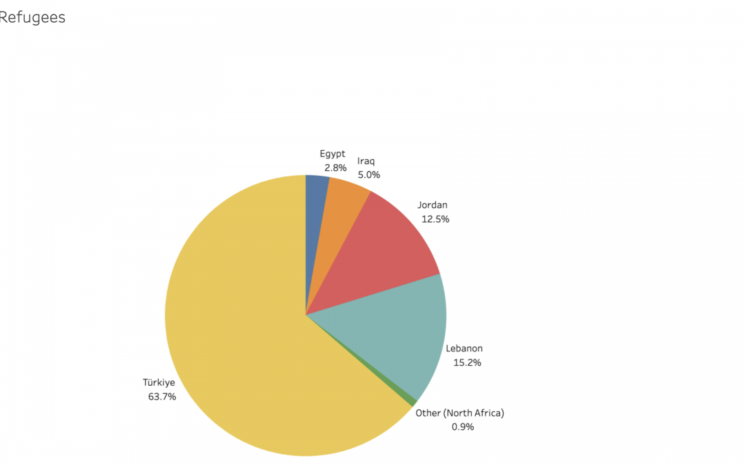
https://public.tableau.com/app/profile/tingting.luo/viz/CountrieswithSyrianRefugees/Sheet1?publish=yes This pie chart contains data from the UNHCR. The pie chart effectively shows the country which has the most Syrian refugees, which is Türkiye, and also shows the...
by dkarnaugh2024 | Jun 8, 2023 | DataViz, DataViz (2023), Highlighted
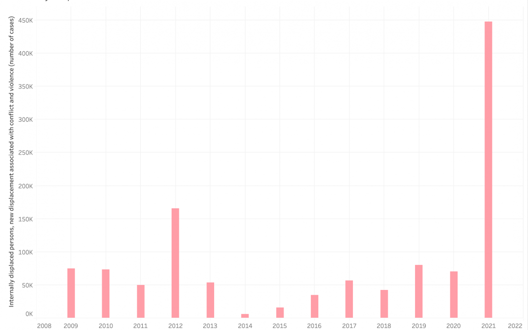
This bar graph shows the amount of new internally displaced people every year, caused by domestic conflict and violence, over the course of 13 years. It is important to align this graph with key moments of Burmese political history. In 2012, the Democratic Party won...


Recent Comments