
Data visualization is the graphical representation of information and data points, with the usage charts, graphs, and maps to help viewers understand trends, outliers, and overall patterns. The primary goal of data visualization is to communicate complex data clearly and efficiently. By presenting formatting data in a visual manner, it becomes easier to identify correlations, spot anomalies, and make data-driven decisions and hypotheses.
Within this general category, there are three subcategories of visualization: explanatory, exploratory, and confirmatory. Of these, explanatory visualization is arguably the most relevant to our course, Refugee Stories. An explanatory summary in data visualization typically accompanies visualizations to provide context, interpretation, and insights. It helps viewers understand the significance of the data presented, and allows for further assumption of trends. The explanatory summary may include a brief description of the data, the purpose of the visualization, an analysis of the trends or patterns depicted, and any conclusions drawn from the data.
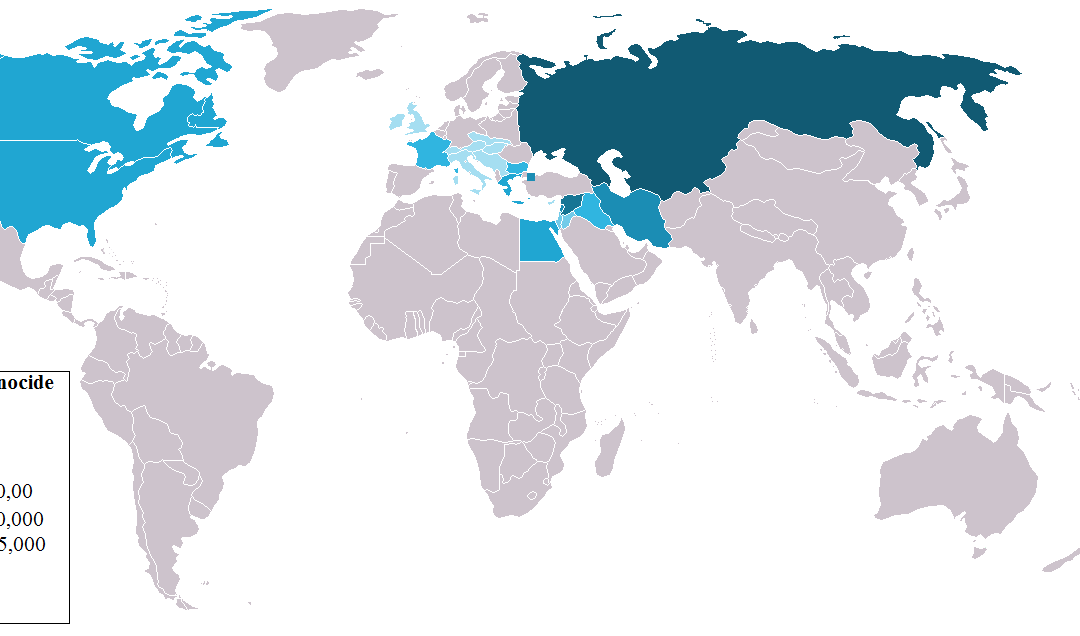
For our course specifically, explanatory visualization has allowed us to see the trends in both immigration and sought refuge over certain time periods. Above is a global map demonstrating the displacement of Armenian survivors after the Armenian Genocide (1915), one quite similar to the graphs we analyzed in class. As explained by the graph, the Soviet Union (Russia) accumulated the most Armenians post-genocide, followed by Iran, Canada, and the United States. This analysis from the graph further aligns with the fact that Russia, currently, is home to the largest Armenian diaspora community.
Recent Comments