by tluo2026 | Jun 8, 2023 | DataViz (2023), Highlighted
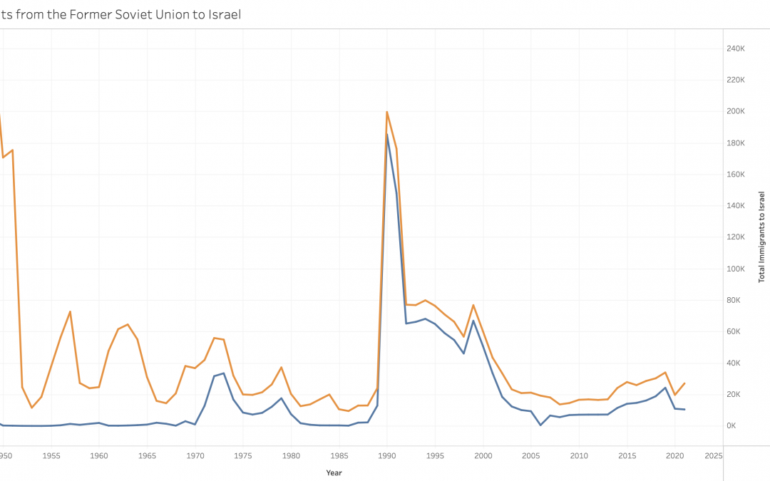
https://public.tableau.com/app/profile/tingting.luo/viz/JewishImmigrantsfromtheFSUtoIsrael/Sheet1?publish=yes This dual-line graph shows the total number of immigrants to Israel and the number of Soviet Jews who immigrated to Israel. This graph not only shows the...
by tluo2026 | Jun 8, 2023 | DataViz (2023)
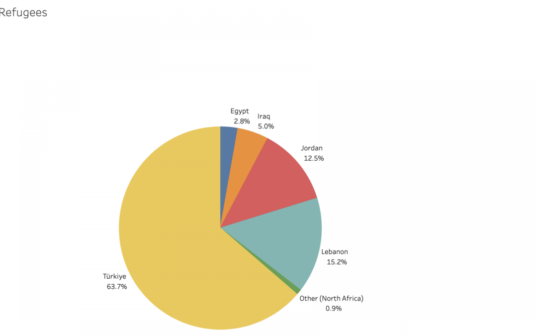
https://public.tableau.com/app/profile/tingting.luo/viz/CountrieswithSyrianRefugees/Sheet1?publish=yes This pie chart contains data from the UNHCR. The pie chart effectively shows the country which has the most Syrian refugees, which is Türkiye, and also shows the...
by dkarnaugh2024 | Jun 8, 2023 | DataViz, DataViz (2023), Highlighted
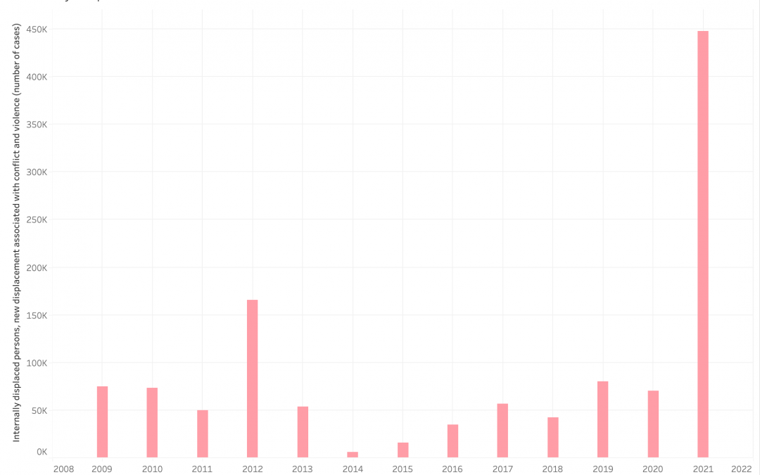
This bar graph shows the amount of new internally displaced people every year, caused by domestic conflict and violence, over the course of 13 years. It is important to align this graph with key moments of Burmese political history. In 2012, the Democratic Party won...

by jluo2025 | Jun 8, 2023 | Stories, Stories (2023), Uncategorized
Products from the local Asian food market are a staple of my Asian-American family’s fridge. It’s a place where we go every week to stock up on supplies of frozen baozi, udon, unique vegetables like water spinach, and many other groceries not found in a...

by ccaligiuri2026 | Jun 8, 2023 | Highlighted, Stories (2023)
I didn’t think this Spring Intensive course could get much better, but our trip to Paterson on Wednesday definitely proved me wrong! Despite the seemingly apocalyptic weather that forced many of us to wear masks, the Refugee Stories group persevered and was able to...


Recent Comments