
This graph is misleading towards the human eye. Here, at first glance without looking at the numbers, it looks like the democrats have about 3 times as many people who agrees compared to the other political parties when that is incorrect. There is actually a very minimal difference between the democrat and other political parties.
Misleading Graph
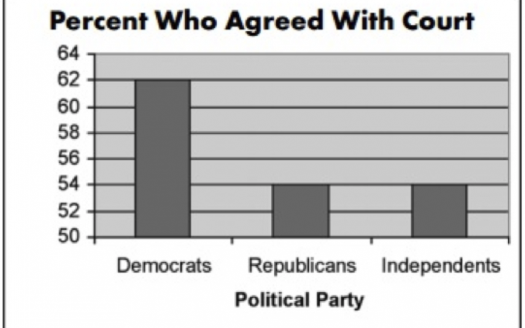
I agree with your point that this graph makes it seem that partisan differences are greater than they actually are–the numbers are not falsified but the bar graph does not provide the proper context.
The creators of this graph were clearly trying to manipulate people with this information, glad that they were called out!
I was almost tricked by this graph too. Great analysis, it helped highlight how easily we can be tricked by graphs.