
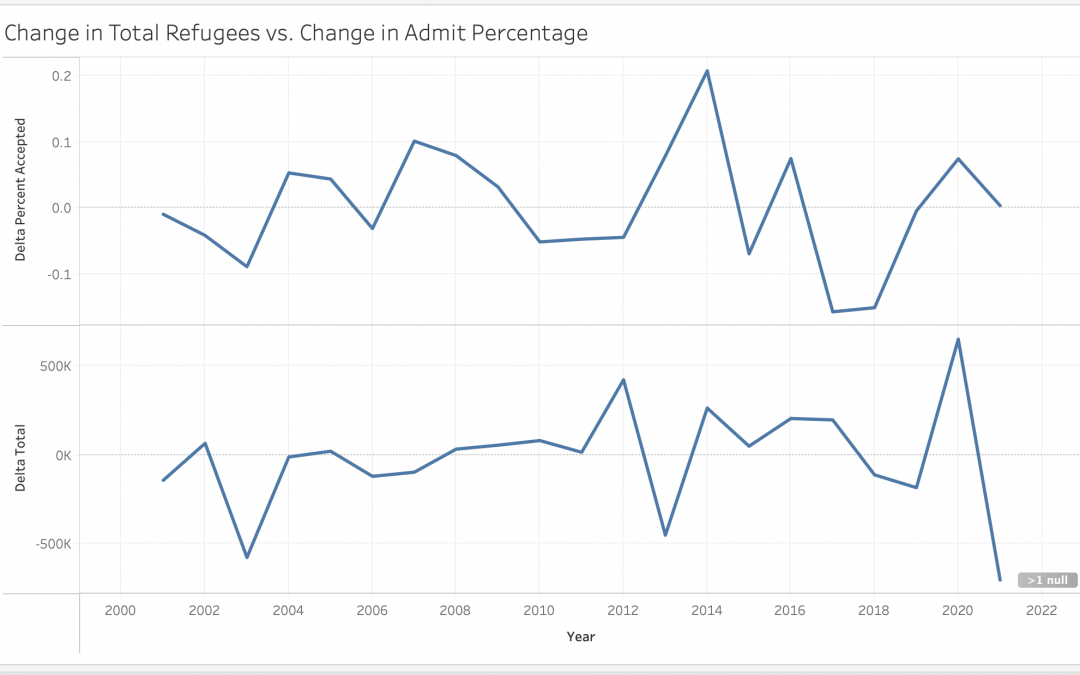
This graph shows the change in refugee applications vs. admittance rates over time. The peaks and troughs of the two lines match up reasonably well suggesting that refugee admittance rates are flexible–nations increase their quotas to accommodate emergency increases in applications.
Change in Refugee Applications vs. Change in Admittance Rates
nice